
Web Design Tips
Published:

Your website gets traffic. People land on your homepage. And then... crickets.
You check your analytics religiously. The numbers say people are visiting, but nobody's booking calls, signing up for your email list, or buying your services. So you do what any resourceful business owner does: you Google "why isn't my website converting" at 11 PM on a Tuesday, wine glass in hand.
And what does the internet tell you? Add more call-to-action buttons. Make them bigger. Change them from green to orange. Add pop-ups (more pop-ups!). Throw in some urgency timers.
But here's the thing: if your website isn't converting, it's probably not because your buttons are the wrong color.
The Real Problem: Lack of Brand Alignment Creates Visitor Confusion
Let's talk about something most website design advice completely misses: ✨brand alignment.✨
I know, I know. That sounds like one of those buzzwords that gets thrown around in marketing circles without anyone actually explaining what it means. So let me break it down in plain English.
Brand alignment means every single piece of your online presence (your visuals, your messaging, your tone, your offers) works together to tell one clear, consistent story about who you are and who you help. When your brand identity and website design are aligned, visitors immediately get you. They feel it in their gut.
When things are misaligned? That's when you get the crickets.
Here's what's actually happening: your potential clients land on your website, and their subconscious brain is picking up on a thousand tiny signals. And if those signals don't match up, they feel friction. Not the kind they can name, but the kind that makes them think "hmm, something feels off" and quietly click away.
This is especially common for female founders in those early years of business who've been DIYing their brand and website. You've pieced things together as you've grown, grabbing a template here, a Canva design there, maybe using colors you liked without a real strategy behind them. And listen, there's absolutely no shame in that. We've all been there. But at some point, that patchwork approach stops serving you.
What Misalignment Looks Like
So what does misalignment actually look like in practice? Let me paint you a picture (because as a graphic designer, painting pictures is kind of my thing).
Your messaging says one thing, your visuals say another. Maybe your copy is warm, personal, and speaks to intimate 1:1 client relationships, but your website uses cold, corporate stock photos and sterile colors. Or you're positioning yourself as a premium service, but your graphic design looks like it was thrown together in an afternoon (because, well, it was).
Your "vibe" shifts from page to page. Your homepage feels modern and minimal, your about page looks like a Pinterest mood board from 2019, and your services page could belong to an entirely different business. Your visitor is getting whiplash trying to figure out who you actually are.
Visitors can't quickly understand who you help and how. This is the big one. When your brand identity isn't clear, people have to work too hard to figure out if you're the right fit for them. And here's a truth bomb: people won't work that hard. They'll just leave and find someone whose website immediately clicks.
If you're nodding along thinking "oh no, that's totally my website," take a breath. You're not alone. Most business owners I work with come to me with these exact struggles. The "I'm drowning in templates and nothing feels like me" struggle is so real.
The Trust Factor
Let's talk about something that doesn't get discussed enough: how visual consistency builds credibility.
Think about the last time you landed on a website that just felt... professional. You probably couldn't name exactly why, but you trusted it. You felt confident that this business knew what they were doing.
Now think about a website that felt thrown together. Maybe nothing technically wrong with it, but something just felt amateur. Be honest: did you trust that business with your money? Probably not as much.
That's the trust factor at work.
When your website design for small business looks like a DIY patchwork (mismatched fonts, inconsistent colors, photos in different styles, a logo that doesn't quite fit anywhere), it triggers doubt in your visitors' minds. Not conscious doubt, necessarily. But that little voice that whispers "if they can't get their own brand together, can they really help me with mine?"
And here's where it gets even more important: you have about three seconds to make an impression. Three seconds for someone to decide whether to stay and explore or bounce back to Google. That's the reality of online attention spans.
What impression is your website making in those crucial three seconds?
The Story Your Website Should Tell
Here's what people get wrong about website conversions: they think it's about having the prettiest design or the cleverest copy.
But conversion isn't about pretty. It's about strategic.
Every element on your website should be guiding your visitor toward one clear action. Not five actions. Not "here are all the things I do and all the ways you could work with me." One primary path from stranger to subscriber to client.
Think of your website as a journey. Someone who's never heard of you before lands on your homepage. What happens next? Ideally:
They immediately understand who you help and what transformation you offer
They feel seen in your messaging ("yes, that's exactly my problem!")
Your visual brand identity makes them feel something that aligns with your values
They're naturally guided to take the next small step (usually signing up for your email list)
Everything they see reinforces the same message: you're the right person to help them
That's strategic design. That's brand alignment. That's what improves website conversions.
Pretty design without strategy? That's just decoration. And decoration doesn't pay the bills.
What Alignment Actually Feels Like
I want you to imagine something for a second.
Imagine opening your website and feeling genuinely proud. Not "well, it's good enough for now" proud. Actually proud. The kind of proud where you excitedly send the link to potential clients instead of apologizing for it in advance.
Imagine the ease of knowing every visual decision has already been made. No more Sunday afternoons lost to tweaking colors or rearranging sections, hoping something will magically start to feel right. No more guessing what looks "on brand" because your brand identity is crystal clear.
That's what alignment feels like for you.
Now imagine what it feels like for your visitors.
They land on your site and immediately think "oh, this person gets it." Everything just makes sense. The visuals match the message. The tone feels consistent. Within seconds, they understand exactly what you do and who you help. They feel that instant connection, like you're speaking directly to them.
That's when conversion happens. Not because you added another call-to-action button, but because you created coherence.
This is what I help female founders create here at our design studio. Because you shouldn't have to be a designer to have a brand and website that feels like a true reflection of your vision. You just need a partner who can take what's in your head and turn it into something visual that actually works.
The Bottom Line
If your website isn't converting, conversion tricks aren't the answer.
More pop-ups won't fix a brand identity crisis. A different button color won't create clarity where there's confusion. Another template won't solve the deeper problem of misalignment.
The real solution? Getting everything on the same page. Creating that coherent brand experience where your messaging, your visuals, your offers, and your purpose all support each other.
That's when your website stops being something you apologize for and becomes something that works for you. That's when visitors stop clicking away confused and start converting into clients.
Because conversion isn't about tricks. It's about coherence.
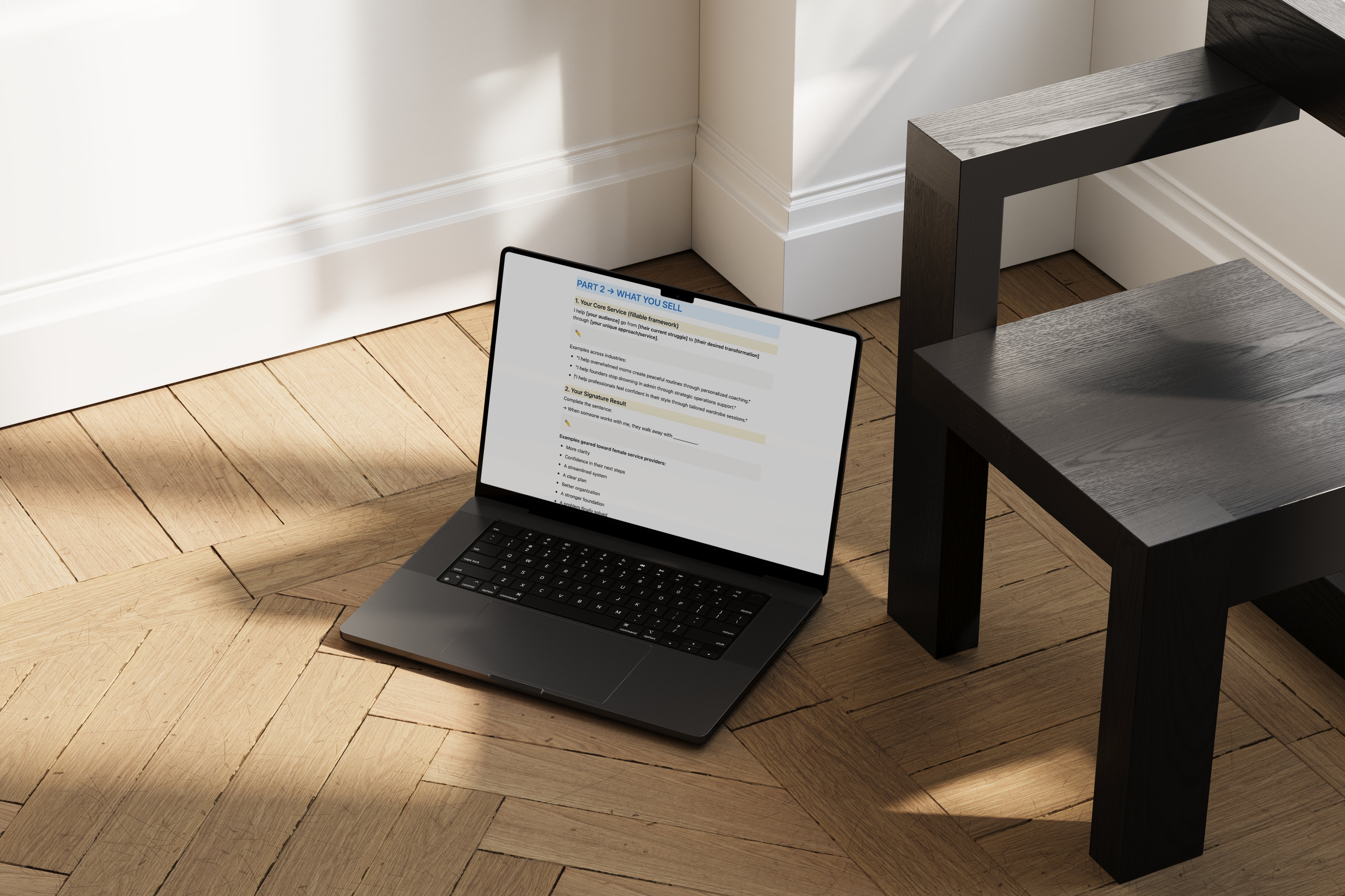
Ready to create a website that finally feels like you? Download The Rooted Website Workbook for FREE and start building the clarity and alignment your brand deserves. It's time to stop guessing and start converting.
Looking for support bringing your brand vision to life? As a Montreal design studio specializing in brand identity and website design for small business owners, I help female founders move past the DIY struggle and into brands that feel as intentional as the businesses they've built. Let's chat.
Similar Posts


Meet the author & founder of kohi design studio
Hi, I'm Serena🌟
I'm a Montréal-based brand and web designer, *obsessed* with crafting high-impact brand and website experiences. I’ve supported 50+ women-led businesses and crafted hundreds of branding and website assets that helped businesses grow with clarity and confidence.

